Accessible Web Design: How and Why
Accessibility Helps Everyone
While people with disabilities are in the minority, they still account for a large number of users. According to the CDC, millions of Americans have eyesight or audio impairments.
A wide variety of users will use your site, and it’s important to avoid excluding any of them.
But accessible design isn’t just for them - it benefits everyone. Ever used subtitles to watch a video in a loud room? Made your font size bigger when your eyes got tired? You’ve profited from accessible design.
So how do you make sure your website is accessible?
Don’t Turn Your Webpage Into an Eye Exam
Use clear, readable fonts with appropriate sizing. Don’t forget about users with screen readers. Provide clear and informative alt text for every image.
Use High Contrast
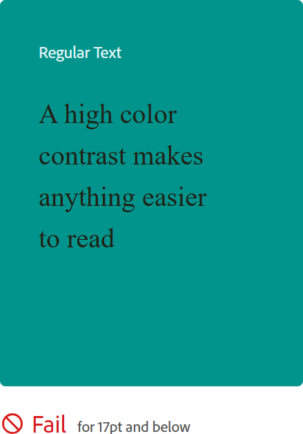
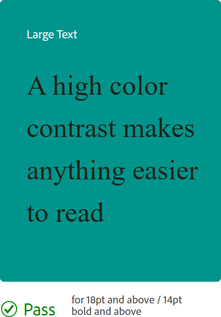
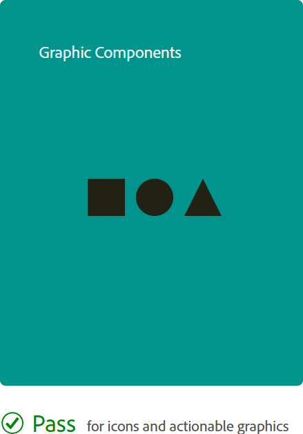
This includes both text and graphical elements. Not sure if your color scheme is accessible? Test it with WebAIM.org or Adobe Color Wheel. They’re both free and easy to use. Bonus: The Adobe Color wheel also has a color blind simulator.
Be Careful With Motion
Don’t abuse animations. If you use them, do so sparingly. Be sure to provide the option to pause or turn them off.
Excessive motion on your site can trigger vertigo, motion sickness, and even seizures. If such usage is unavoidable, provide a flash warning.
Neuroinclusive Design
Under the umbrella of accessibility is neuroinclusive design, meaning designers are taking initiative to make websites more accessible for users with ADHD, dyslexia, autism, and more.
Dyslexia
Don’t use black text on a white background. This creates distortion for dyslexic users. Instead, use a dark gray on an off-white.
Use a sans serif font. The cleaner lines are easier to read.
ADHD
Avoid large blocks of text and make it easily scannable. Don’t use an excessively complex navigation system, and use a clear information hierarchy. Minimize distractions with a clutter-free interface.
Autism
Autistic users are susceptible to sensory overload. Don’t bombard them with bright colors and loud sounds. As with ADHD users, keep your interface clean.
Make it Intuitive
Ultimately, the best thing you can do for all users is to make your site as intuitive as possible.
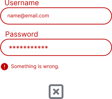
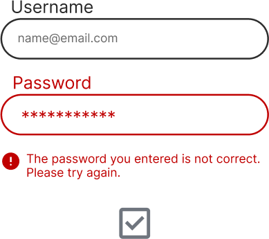
That means everything must be clear. Error codes should be specific. All links and buttons need explicit labels. Your website isn’t a scavenger hunt.
In Conclusion
It can be a lot to manage, but ultimately, maintaining accessibility on your website will universally reduce user frustration.
That said, accessible design doesn’t mean stripping your site of everything that might make it interesting. The best designs are versatile. You don’t have to exclude all animations and fill your screen with 60 pt text, but instead provide the option to disable excess motion and zoom in.
One-size-fits-all isn’t always practical, but you can provide options for users to interact with the site based on their specific needs.
A big plus, it will boost your SEO too! Want to learn more? Check out more of the WCAG's accessibility guidelines.